Samsung Must Improve One UI 7.0 on Tablets Before It’s Too Late

Samsung released the Galaxy Tab S10 FE and its Plus sized counterparts recently. Both tablets shipped with the One UI 7.0 redesign, but received mixed opinions. We’re going to break down how bad this update really is on tablets and how Samsung could improve things.
What’s wrong with One UI 7.0 on Tablets?
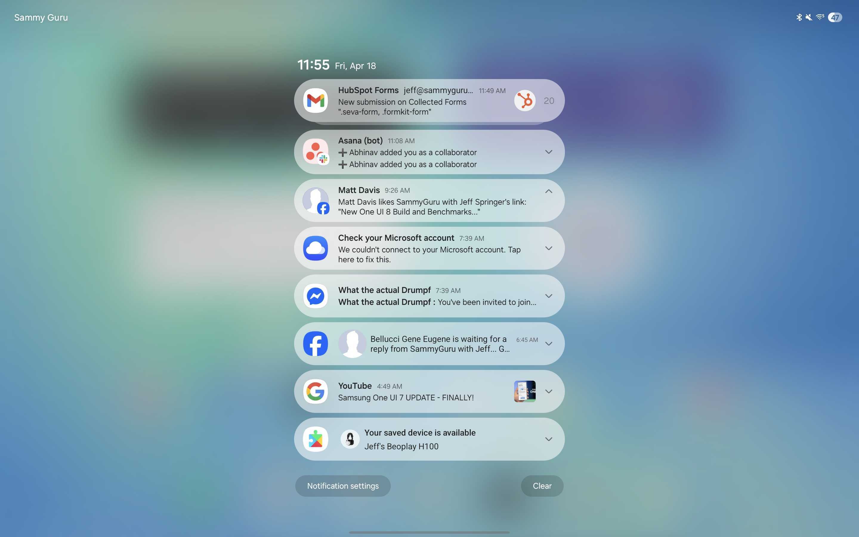
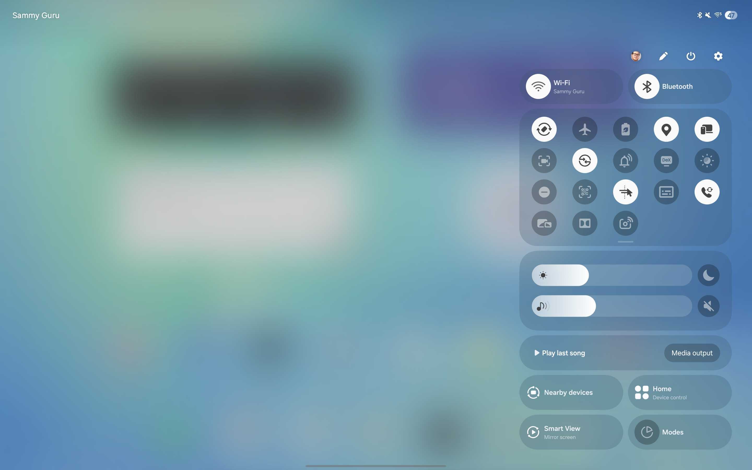
The problem here is that tablets were an afterthought. Samsung must’ve gotten so caught up with the One UI 7.0 update on phones that they forgot they made tablets. This is rather evident when you look at redesigned elements brought over from the phones, like the split Quick Settings and Notifications. When oriented in portrait, both elements are fixed to the top centre of the display. Which not only is bad for reachability, especially on behemoths like the Tab S10 Ultra, but also leaves plenty of empty space on the sides and bottom of the display. In landscape, at least the quick settings orient to the right side of the screen, where you swipe from. But notifications remain centred. It’s basically a blown up phone interface.
How could Samsung fix it?
I have experience in the UI/UX design world, and one of the basic principles when working with larger screens is to use the extra space you have wisely. Fit more information on screen, while remaining simple and approachable to anybody. Especially those with as wide of a customer base as Samsung.
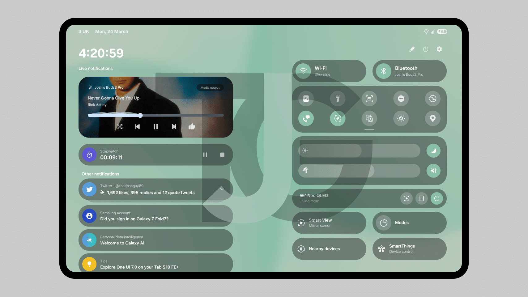

I had a very similar idea previously for a dual column layout, similar to Google’s Pixel Tablet. But truly think this is the answer. Does it utilise the extra space given by these form factors? Yes. Does it fit more information on screen at once? Yes. Is it easy to understand how the interface works? Yes. And in fact, it’s easier to access, with just a single swipe. This can work well on foldables too, with each section shrunk down to almost two phones put together.
What Samsung got right with One UI 7.0 on Tablets
We must give credit where credit is due. Samsung did get many things right with their software on larger screens. The new floating taskbar is much better than the fixed solution of previous versions. Easy to hide away and bring back up when needed. Samsung’s app design language remains excellent on larger screens, with the navigation drawer pinned to the left side for quickly hopping to a different section of the app. Their multi tasking features are indeed fabulous, with split windows and floating windows on offer. And we cannot forget DeX, which takes that experience to a whole new level, with a desktop look and feel that’s perfect for getting stuff done.
And there is hope for One UI 8.0 too. Development on this next major version is already underway on the Z Flip 6 and Z Fold 6, the latter of course having a larger screen. Pair that with the update launching on the foldables, and there’s a strong chance that some new features and UI optimisations for larger screens are in the works. Stay tuned for any news on new software, hardware and more of Samsung’s shenanigans.
Follow us on Google Discover & set us as a preferred source in Google News
Share this Post
___________________________


New Blog Posts
___________________________
First Set of Pixel 11 Pro XL Renders Are Here
Pixel 11 Pro XL CAD renders show minimal design changes
Is Samsung Preparing One UI 8.5 Beta for Galaxy Z Fold 5 and Flip 5?
Samsung may launch a One UI 8.5 beta program for its 2023 foldables
Galaxy S25 One UI 8.5 Beta May Run Longer Than Expected
Galaxy S25 series’ One UI 8.5 beta may stretch to 10 rounds

