Samsung’s Clock App Looks Completely Different in One UI 8.5

We’ve known for a while that Samsung’s One UI 8.5 update would introduce meaningful visual upgrades across the system. With the beta expected next week, the leaks are now arriving quickly. After the refreshed Calculator app surfaced recently, we have our first look at the redesigned Clock app. Here’s a breakdown of the major changes.
One UI 8.5 improves Samsung’s Clock app in many ways
The Clock app in One UI 8.5 doesn’t just tweak colors, but it completely abandons the old flat layout in favor of a more elegant, layered interface (via X/@UniverseIce). Both Light and Dark modes now feature rich gradients, depth effects, and a more polished visual style that stands out when compared to earlier versions.
Samsung is also saying goodbye to the legacy navigation bar. In its place is a floating pill-shaped menu at the bottom of the screen. Labels are gone, so users now rely entirely on icons to switch between Alarms, World Clock, Stopwatch, and Timer. This redesign focuses on simplicity and reducing visual clutter, though it may take some getting used to.
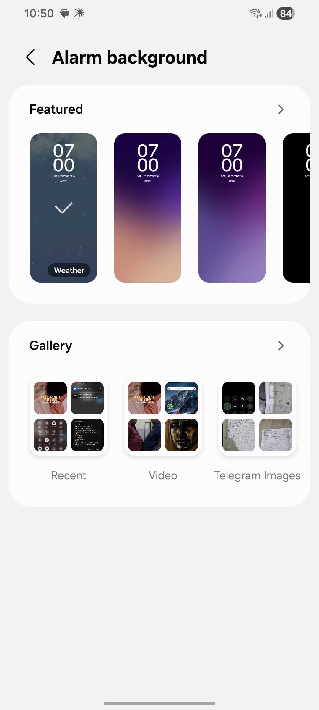
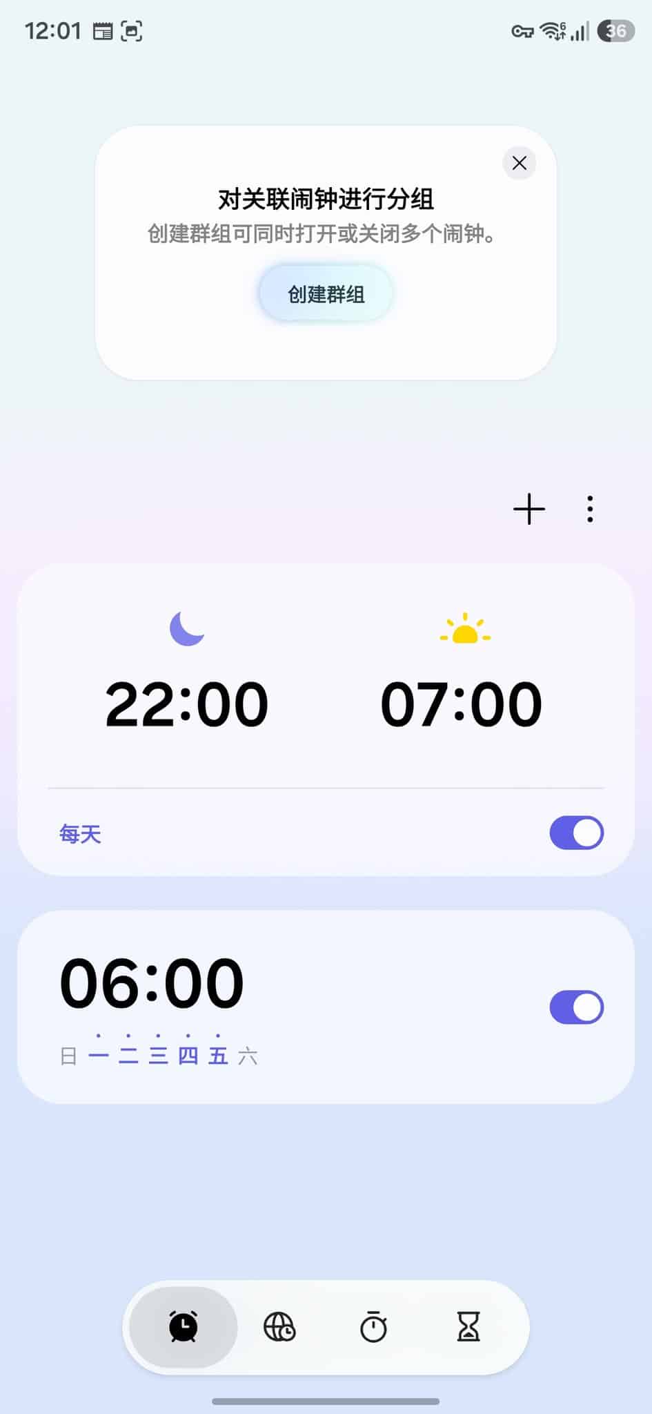
The Alarm tab gets a cleaner layout with a large gradient card housing all alarms in a unified list. Alarms no longer appear as separate, bordered cards, making it easier to scan at a glance. Alarm backgrounds also add a new Weather option, which likely auto-changes based on the current weather at your location.
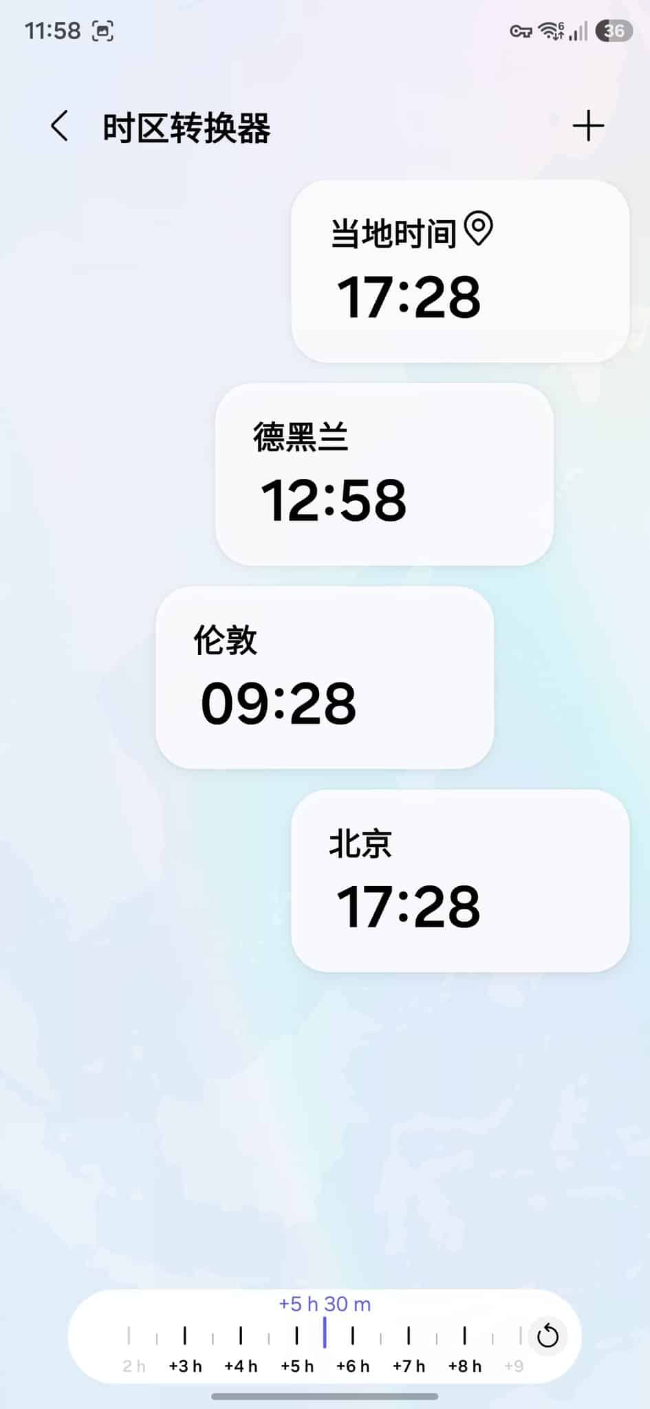
The World Clock gets a huge functional upgrade in One UI 8.5, with a world map background giving it a more thematic and visually appealing layout. Users can add multiple cities as usual, but this update introduces new card layouts that can be toggled for a different view. A new time-zone slider lets you drag through different hours of the day and instantly compare times across cities.
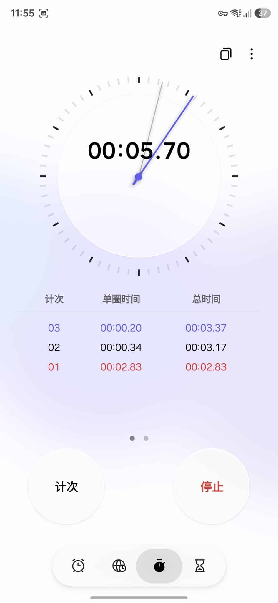
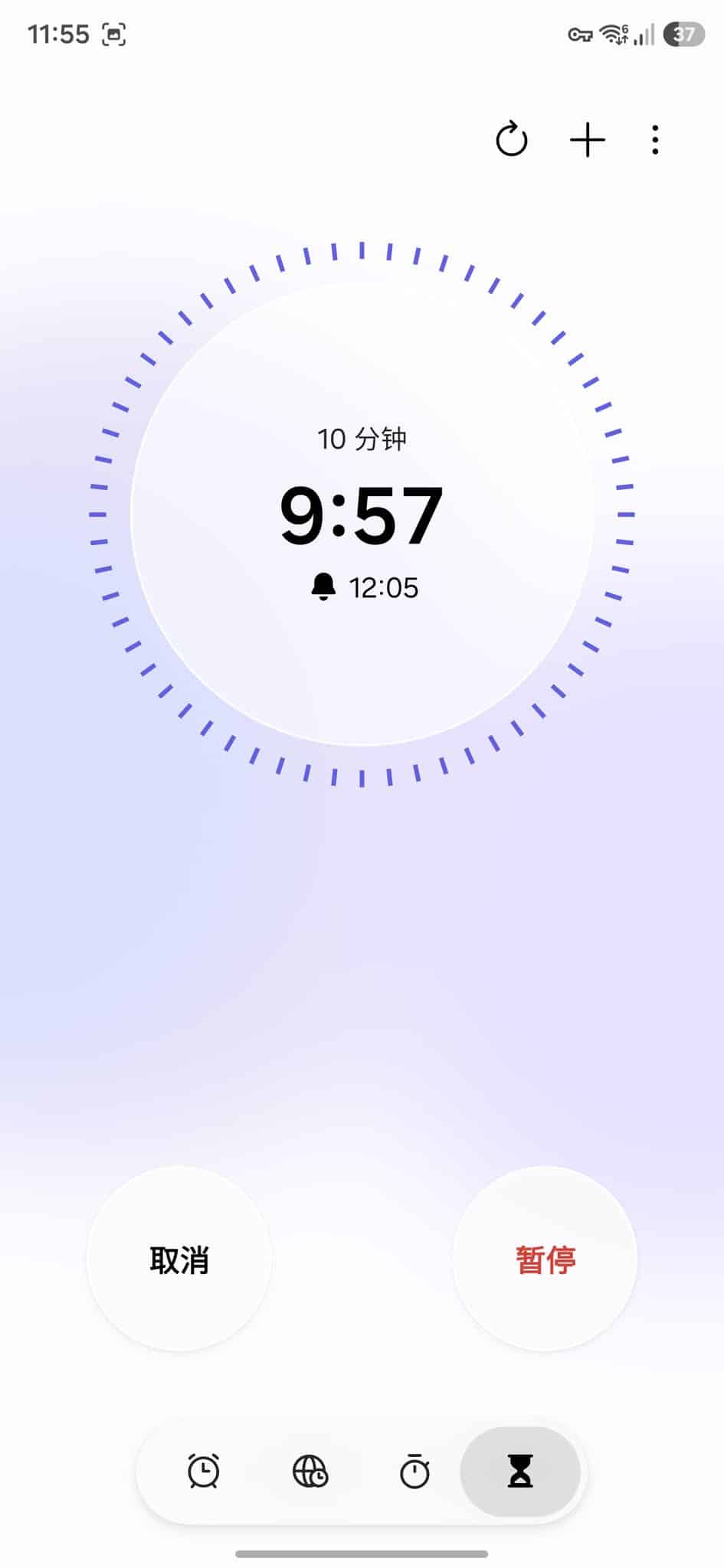
Likewise, Stopwatch adds a dual digital-analog hybrid design, with a circular clock, tick marks, and virtual clock hands. This replaces the plain digital-only layout of earlier versions. Timer, meanwhile, replaces the flat background with a pleasing gradient, matching the energy of the other tabs. It also features a larger circular start button.
The new design of Samsung’s Clock app in One UI 8.5 looks much more sophisticated and ties into the gradient-heavy style across the system. While there aren’t many exciting new features, these UI changes make the app feel more modern and cohesive. Stay tuned for official confirmation on One UI 8.5 Beta.
Follow us on Google Discover & set us as a preferred source in Google News
Share this Post
___________________________


New Blog Posts
___________________________
First Set of Pixel 11 Pro XL Renders Are Here
Pixel 11 Pro XL CAD renders show minimal design changes

Is Samsung Preparing One UI 8.5 Beta for Galaxy Z Fold 5 and Flip 5?
Samsung may launch a One UI 8.5 beta program for its 2023 foldables
Galaxy S25 One UI 8.5 Beta May Run Longer Than Expected
Galaxy S25 series’ One UI 8.5 beta may stretch to 10 rounds

