After months of keeping Galaxy users waiting, Samsung finally released One UI 7 in April. The update is now rolling out to a wide range of devices globally. However, it isn’t without flaws, and some users are already voicing concerns. In particular, Galaxy S24 Ultra owners are frustrated by an unexpected change to the status bar design, adding to the list of complaints.
Galaxy S24 Ultra users don’t like this status bar change in One UI 7
The crux of the issue lies in the increased empty space now present on the left and right edges of the status bar in One UI 7. While this design choice might appear aesthetically balanced on devices with rounded screen corners, it presents a visual incongruity on the sharply cornered display of the Galaxy S24 Ultra.
Since most Galaxy phones have rounded corners, it looks like a lazy work from Samsung. Instead of optimizing the design for sharper corners of the S24 Ultra and a few other models, the company pushed the same design across the lineup. Consequently, the expansive screen real estate of the S24 Ultra feels underutilized.
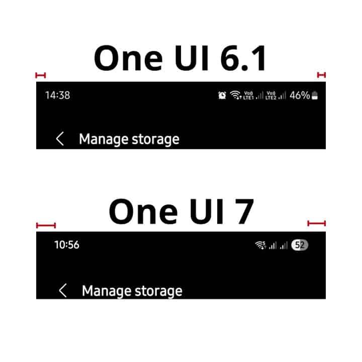
The contrast with the previous One UI 6.1 experience is stark. In the older version, icons snugly occupied the edges of the status bar, maximizing the information displayed. The introduction of the additional padding in One UI 7 creates a sense of wasted space. While the space was always uneven, it’s more noticeable in One UI 7 due to extra padding.
Interestingly, this status bar alteration doesn’t seem to be as pronounced on the Galaxy S23 Ultra, which also has sharp corners. While some S23 Ultra users have noted a slight increase in the empty space, the change appears subtle enough to be largely overlooked. Perhaps its curved edges make things look better.
Samsung ignored user feedback
It’s worth noting that Galaxy S24 Ultra users reported this problem to Samsung during the beta phase. However, the company ignored the feedback and pushed the same layout in the stable One UI 7 build. The same goes for the battery icon, which also feels a bit odd.
As it stands, the extra spacing in the One UI 7 status bar appears to be an inherent design element that Galaxy S24 Ultra users will have to contend with. Whether Samsung will address this feedback in future updates remains to be seen. Stay tuned for further updates as the situation unfolds.