Here’s Your Best Look at Google Meet in Material 3 Expressive Design Yet

Android 16 is coming very soon in its stable form. Among many other things, it will also include the Material 3 Expressive design. We’ve had our share of early looks at Files by Google, Drive, and Calendar in Material 3 Expressive, and now Meet is joining them.
Here’s how Google Meet looks in Material 3 Expressive design
At Google I/O last week, Google pulled back the curtains on the Meet app’s upcoming redesign. But it wasn’t a detailed look; more of a sneak peek at what’s to come. Thankfully, the fine folks at Android Authority have now shared a closer look at Google Meet revamped in Material 3 Expressive. Before we dive in, you can check out how it will look once the wider rollout happens.
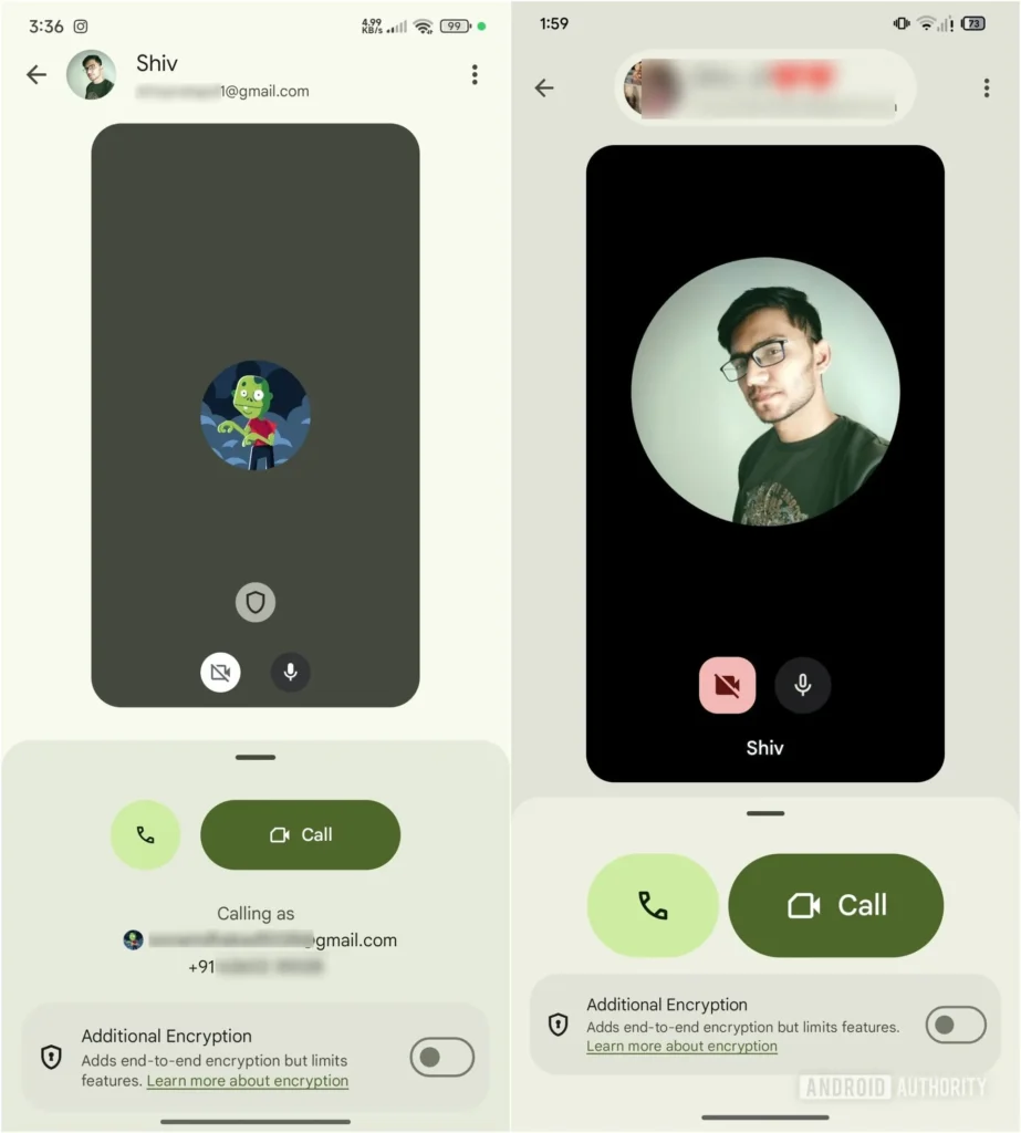
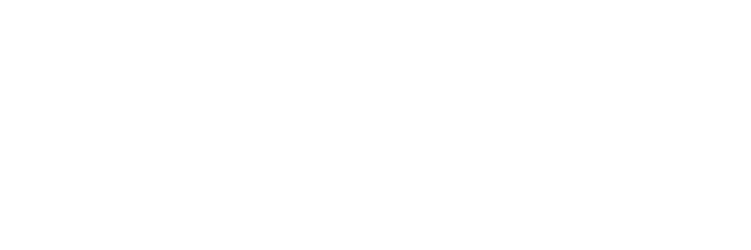
The changes are present in Google Meet v308.0.763202464.duo.android_20250525.16_p0.s. Speaking of what’s new, you’ll notice the call history screen has a cleaner look, with higher contrast that’s easier on the eyes. The “join a meeting” screen is also getting a glow-up, featuring bigger buttons, rounded corners, and a more playful vibe. There’s even a message about the upcoming shutdown of old Duo features, already rocking this fresh design.
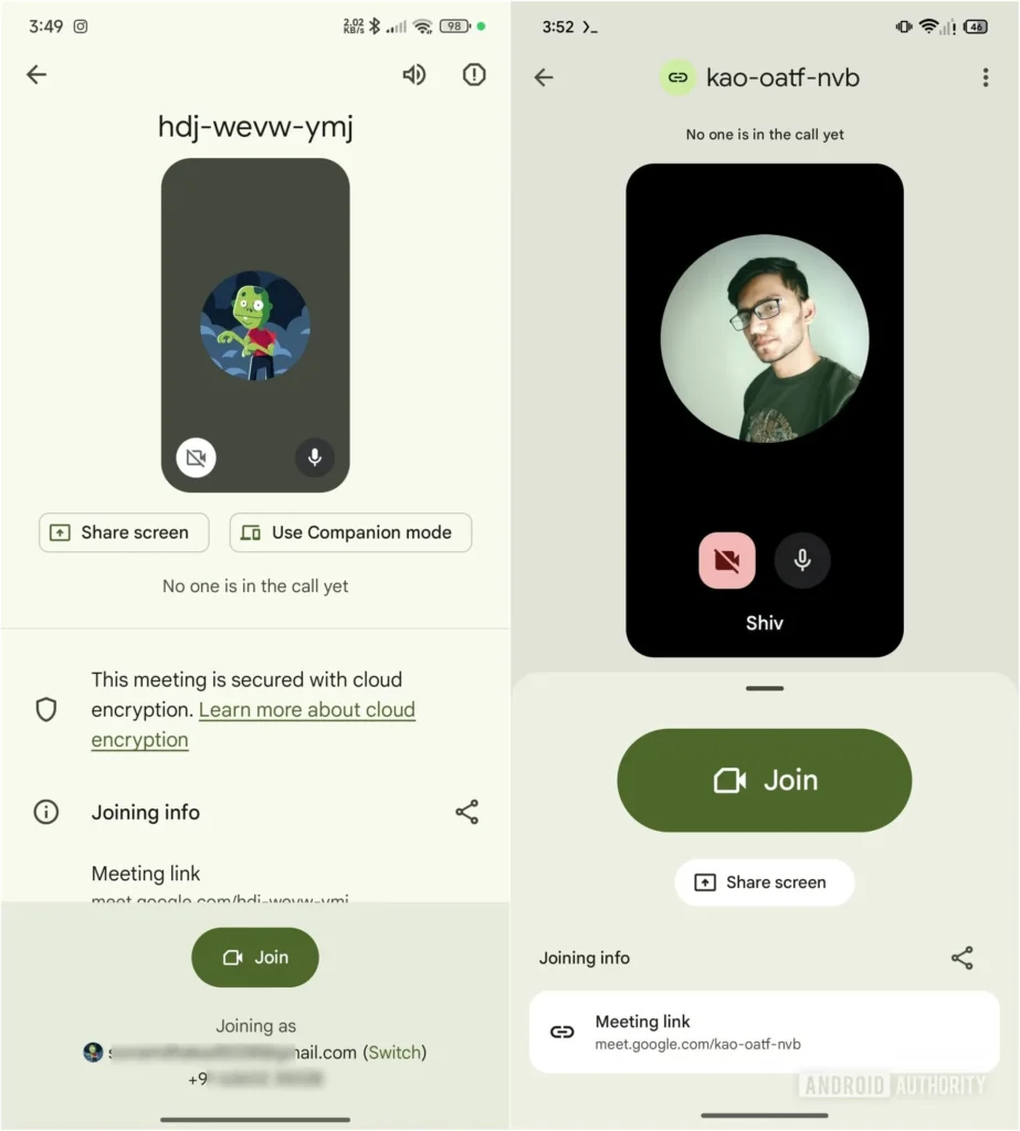
Things really start to pop when you’re about to join a meeting. That big, bold button Google teased last week takes center stage, making it easy to jump right in. The same style carries over to regular one-on-one calls, giving everything a more unified feel. Sure, the bigger elements mean you see a bit less at once, but the layout feels much less cluttered.
That said, we likely won’t see the changes roll out widely until Android 16 is official. This means a few more weeks to wait. Take it easy, it won’t take much longer. For now, we’ll just have to hang tight and see what Google has up its sleeve.
Follow us on Google Discover & set us as a preferred source in Google News
Share this Post
___________________________


New Blog Posts
___________________________
First Set of Pixel 11 Pro XL Renders Are Here
Pixel 11 Pro XL CAD renders show minimal design changes

Is Samsung Preparing One UI 8.5 Beta for Galaxy Z Fold 5 and Flip 5?
Samsung may launch a One UI 8.5 beta program for its 2023 foldables
Galaxy S25 One UI 8.5 Beta May Run Longer Than Expected
Galaxy S25 series’ One UI 8.5 beta may stretch to 10 rounds

