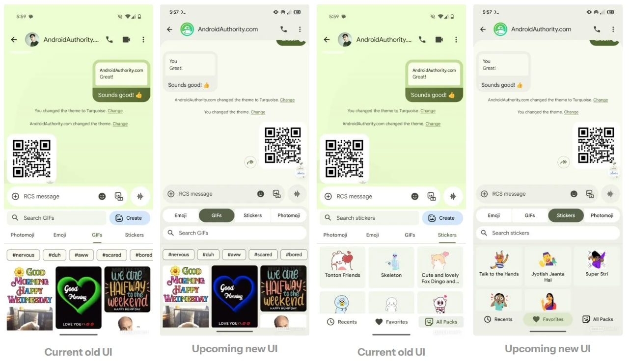
Google aims to offer its Messages app users an improved experience. The company is testing a desaturated redesign for the Google Messages app that will replace bright colors with muted tones. On top of that, it will make some UI changes in emoji menus, search bar positions, conversation views, and attachment shortcuts. These changes are hidden in the latest beta version of the Messages app, so regular users can not experience the new UI at the moment.
APK teardown hints at Google Messages UI tweaks
A recent APK teardown of Google Messages v20250408 beta by AssembleDebug (via Android Authority) revealed code hinting at many changes to the app’s UI. The publication managed to activate these changes on the Messages app, giving us a sneak peek of the new UI before its public rollout.
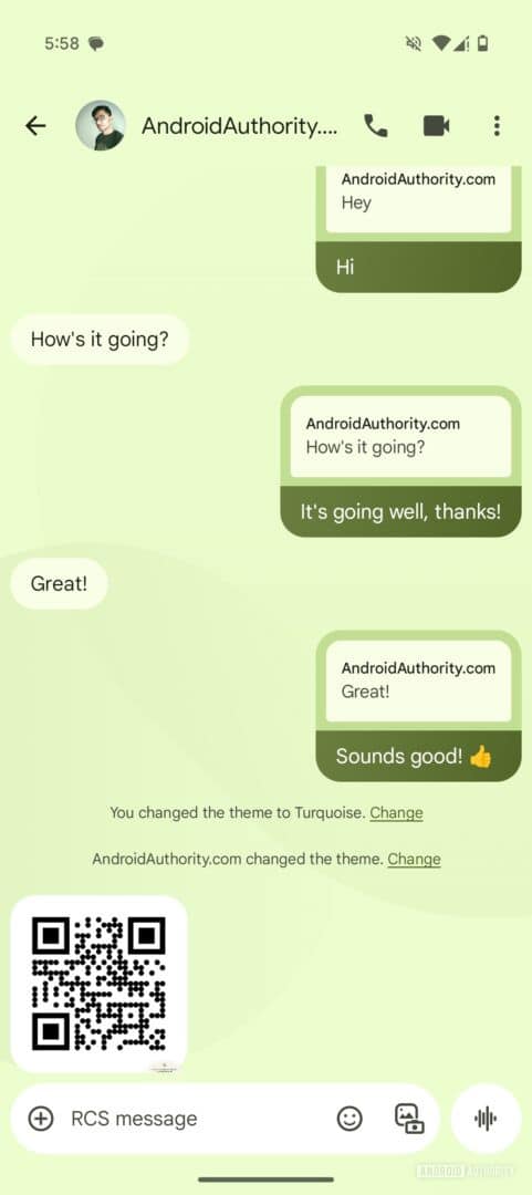
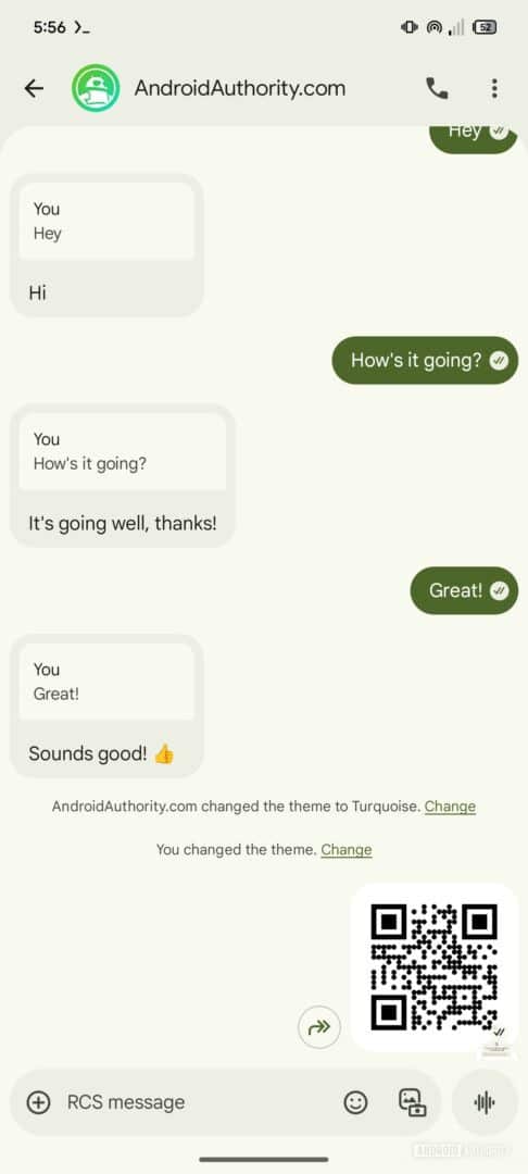
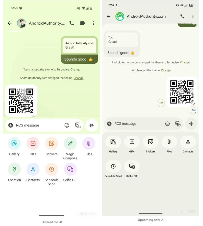
The Google Messages app is getting rid of that old brighter color for the main conversation screen in favor of a dull background. Sent messages are easy to read, but incoming ones could stand out more in the dull background. Some might also notice softer curved corners right below the header. Additionally, the attachment shortcut menu uses monochrome icons devoid of color, which look a bit dull.
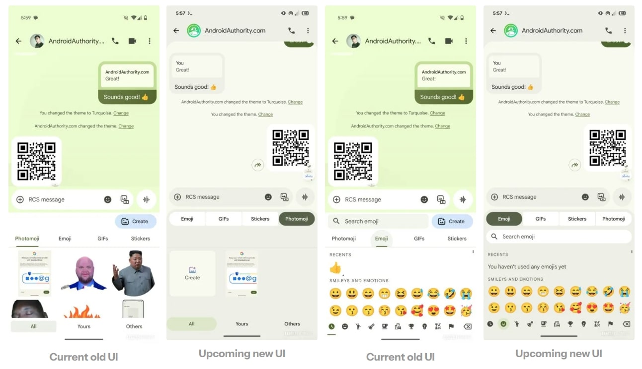
- Current Old UI
- Upcoming New UI
As many people use emojis more frequently than Photomojis, the new UI puts the emoji menu first and the Photomoji menu at the very end of the list. Google has also switched the positions of the search bar and the tabs in the new UI, making it easier for users to differentiate between the search field and the text compose field. On top of that, it has moved the Create button for Photomojis, which now appears inside the Photomoji tab. The refreshed design of tabs aligns better with Material Design guidelines.
Furthermore, Google is making some UI tweaks for RCS Business messages. The Call-to-Action buttons now stand out more, even with their desaturated look. The ‘Unsubscribe’ option at the bottom is now more noticeable. It is worth noting that Google is just testing the new UI for its Messages app, but there is no guarantee it will roll out these changes publicly. We will let you know if Google rolls out the new UI to the stable branch in the future.

