Google Maps’ Material 3 Expressive Redesign Makes Its Way to Galaxy Watches

Google is apparently rolling out a fresh redesign of the Maps app for the Galaxy Watch. It leans on Google’s Material 3 Expressive design language, making the app easier to navigate on the Galaxy Watch’s small screen.
Google Maps’ Material 3 Expressive is already rolling out to some Galaxy Watches in beta form
Currently, Google Maps’ redesign is rolling out in beta to Galaxy Watch users on Wear OS 5, according to reports from Android Authority and 9to5Google. You could say this update is arriving even before Wear OS 6 (or One UI Watch 8) officially launches. There are plenty of improvements and additions that you’ll discover as you read on.
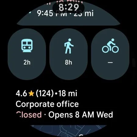
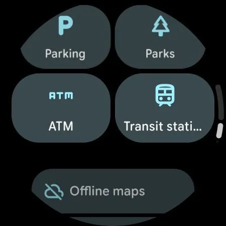
Screenshots: Android Authority
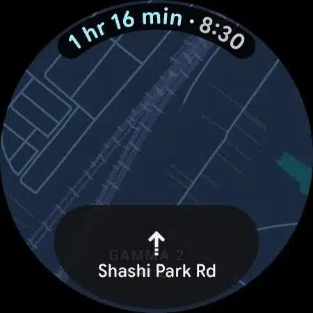
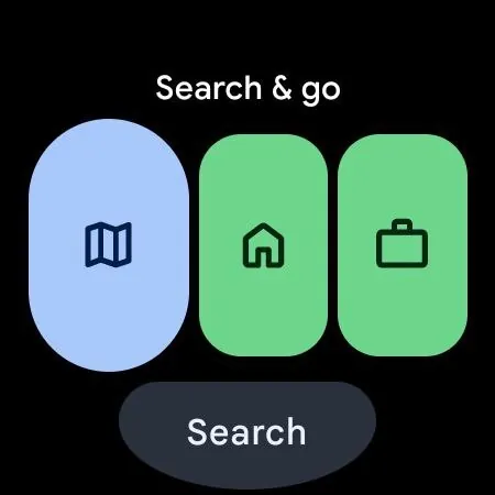
Gone are the days of tiny, cramped circular buttons. Instead, Google Maps now features two rows of large, pill-shaped buttons that prioritize the most important functions. The largest pill opens the map layer, while a prominent voice search button sits right beside it. Home and Work shortcuts are simplified into colorful pills that don’t display full addresses, saving precious screen space and making quick taps easier.
The interface leans heavily on teal accents, matching the Google Maps mobile app and adding a refreshing splash of color to the watch experience. Recent places appear as a clean list with updated card styles, while a grid of popular categories sits below for quick access.
One standout change is the redesigned “Search & go” Tile, which now packs more features into a smaller space. It offers quick shortcuts to Home, Work, recent places, and nearby spots.
This update marks a clear shift from the previous minimalist design, which buried many options in stacked lists. Instead, Google is embracing larger touch targets and more vivid visuals to make navigation on the Galaxy Watch less frustrating and far more intuitive.
Follow us on Google Discover & set us as a preferred source in Google News
Share this Post
___________________________


New Blog Posts
___________________________
First Set of Pixel 11 Pro XL Renders Are Here
Pixel 11 Pro XL CAD renders show minimal design changes

Is Samsung Preparing One UI 8.5 Beta for Galaxy Z Fold 5 and Flip 5?
Samsung may launch a One UI 8.5 beta program for its 2023 foldables
Galaxy S25 One UI 8.5 Beta May Run Longer Than Expected
Galaxy S25 series’ One UI 8.5 beta may stretch to 10 rounds

