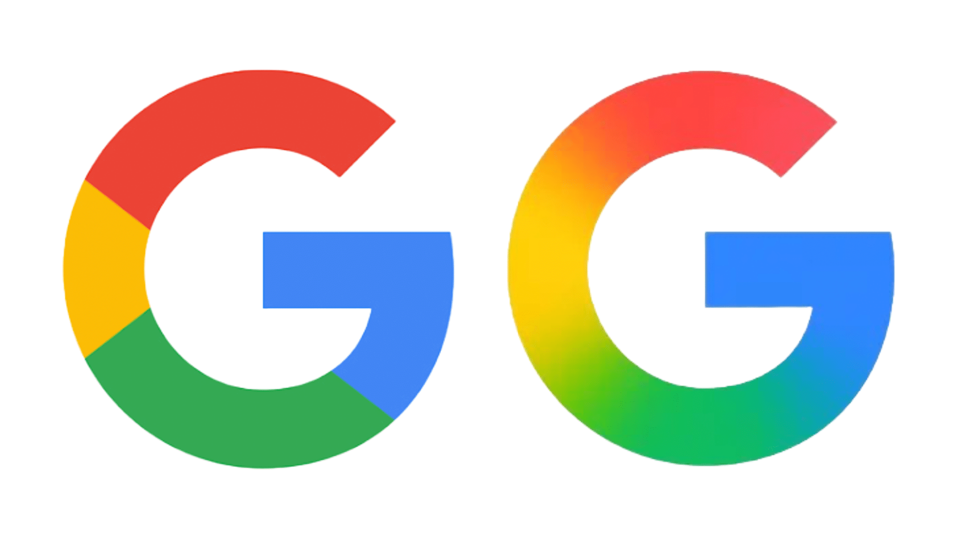
It’s not every day you find a trillion-dollar company making changes to its logo, but you do witness history in the making, sometimes. That’s how the tech world works, seemingly. After a decade, Google is updating its iconic “G” logo, first spotted by our friends at 9to5Google.
Google is quietly rolling out the updated “G” logo
The last major change came in September 2015, when Google switched to a cleaner, modern font called Product Sans. Along with that, the “G” icon changed from a lowercase white ‘g’ on a blue background to the colorful four-section “G” we’ve been seeing since.
Now, Google is refreshing that same “G” logo. But it’s easy to miss at first glance. The new design keeps the same red, yellow, green, and blue colors, but instead of using sharp divisions, the colors now smoothly blend into each other. Red flows into yellow, yellow into green, and green into blue. The result is a softer, more vibrant look that fits in with Google’s newer design style, like the Gemini logo.

The update is already live in the Google app on iOS. On Galaxy devices and Android, it started rolling out with Google app beta v16.18. For now, the new logo only appears in those places, it hasn’t replaced the old icon on the web, on most Android phones, or in the favicon in your browser tab.
Google hasn’t changed its full six-letter logo this time, and it’s unclear if it plans to. But since other apps like Chrome or Maps also use similar color styles, we could see this gradient style come to more Google products down the line.
Even though it’s a small visual tweak, it marks a rare moment. Google doesn’t update its logo very often. When it does, it’s a sign that something bigger may be on the horizon. And we’re all in for the change.


