Google Search Widget Just Got a Tiny Makeover
While we were busy caught up in the One UI 8 beta rollout, Google quietly released a small update. Google is now updating its Search widget with a fresh design that aligns with the Material 3 Expressive style. It’s not a complete redesign, honestly, rather subtle.
Google’s redesigned Search widget is now rolling out on Android
The classic Google Search widget has been a staple on Android phones for years. It used to be a simple pill-shaped bar with the Google “G” on the left and three icons on the right: a shortcut, voice search, and Google Lens. Now, Google has added a new layer to this design by placing the search bar inside a larger pill-shaped container. You can see it side-by-side with the current (old) widget, thanks to 9to5Google.
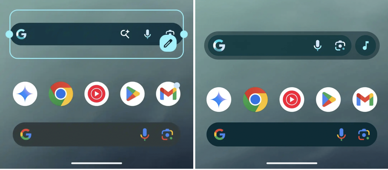
If you prefer not to use the shortcut, you can turn it off completely, and the widget will stretch wider without the separate circle. The Google “G” logo still opens the Google app, while the microphone and Lens icons remain inside the main bar. One important detail is that the widget needs to be placed at a 4×1 size to show all four buttons. The older 3×1 size only shows three, so you might need to adjust your home screen layout.
Additionally, PhoneArena reports that you can select which icon appears at the very end of the widget. Options include Translate, Weather, Sports, Song Search, and more. The widget’s background is also slightly transparent, letting your wallpaper peek through even if you set transparency to zero.
For now, this new design is only available for the standalone Google Search widget you add manually. If you don’t see the update right away, try force-stopping the Google app or wait a bit as Google rolls it out gradually.
Follow us on Google Discover & set us as a preferred source in Google News
Share this Post
___________________________


New Blog Posts
___________________________
First Set of Pixel 11 Pro XL Renders Are Here
Pixel 11 Pro XL CAD renders show minimal design changes
Is Samsung Preparing One UI 8.5 Beta for Galaxy Z Fold 5 and Flip 5?
Samsung may launch a One UI 8.5 beta program for its 2023 foldables
Galaxy S25 One UI 8.5 Beta May Run Longer Than Expected
Galaxy S25 series’ One UI 8.5 beta may stretch to 10 rounds

